i wanted to add more variety to my ideas of house style, just in case the ones i already had didn't quite work out for me. this collage includes more photos, because i want my magazine to have quite a fresh fashionable feel and these images keep this in mind.
Tuesday, 30 November 2010
Monday, 29 November 2010
magazine house style collage
Final Charity Advert Design
This my final design for a charity advert. i decided to do one for child line, and my message is for people to be more
aware of the pain children suffer in silence and do not tell anyone. the message is towards everyone but children in particular.
I am quite pleased with this final design. i like the way i have edited the photo to look quite simple but meaningful at the same time. i also like the use of scrabble tiles in a jumbled order for my wording. it gives a child like feel to the whole advert.
i think if i was to improve anything, i would add colour to the Scrabble tiles so to lighten the whole thing to give a feel of hope, or red for warning and to also make the whole thing more eye catching.
Thursday, 18 November 2010
Poster emulation
i think this advert i have created is quite effective. the close up image of the girls face highlights her smudges makeup, wide eyed drunken look. the use of bright colours are eye catching and the skin seems almost luminous. the captions " you wouldn't leave the house like this.. why why come home like this?" is simple but gets someone thinking about how they should be careful about their intake of alcohol. i then included a drinkaware.ie logo at the bottom to highlight what campaign this advert is supporting.
( imagery not original and from the Internet).
Monday, 15 November 2010
Friday, 5 November 2010
Although this poster is quite simple, its effective at getting the point of domestic abuse across to its audience. i think that this poster in particular is aimed at children at home, that is why the imagery isn't too disturbing or shocking. the photo goes well with the wording. the hand over the mouth indicates the child is keeping a secret, but the message on the poster is 'don't suffer in silence'. the use of the helpline number is also useful for children who want to speak at. i like the colours in this poster. the black and white editing makes me think of there being no hope left, but the blue lettering in a primary colour simplifies it and makes me think of the colours a young child would use. the font of the lettering is in blocks like scrabble, a game children might enjoy.
This advert caught my eye because i thought the use of the infants milk bottle and teddy bear amongst the beer bottle and fag butts was really effective. it highlights the innocence of children and there is a big contrast between that and the things adults go that can seem irresponsible when having children. the dullness of the photo gives off a depressing vibe and adds to the seriousness of this photo.
I liked this advert because the wording is the main point over the imagery. although the models in the photo reflect how doing drugs can make you look ill and a mess. the wording actually tells us how easy it is to pass on diseases when taking drugs. i like the grungey style of the whole advert. the black background with the white writing is simplistic and Stark, and also the girls faces look kinda of sweaty and pale. like someone who was ill would look. their makeup is smudged and their hair is unwashed. these are not the type of girl that you look at and think their attractive. the whole poster gives off a negative vibe towards drugs. this advert wouldn't be too hard to emulate because i could use some of my friends to portray the look.
Thursday, 4 November 2010
Adverts i liked
This advert in particular really caught my eye. i thought it was smart and effective and would like to maybe reacreate it in my own way. i could use a logo slogan such as "times ticking" or "time is running out" or maybe "it's only a matter of time". i wouldnt say this advert is very shocking, but its interesting and has a good point to it and is a good idea. it would be easy to emulate aswell.
Advertisement- ideas and thoughts
My task is to create or emulate an advert for a certain charity. i could do childline like, talk to frank, cancer UK or any charity of my chose whilst researching adverts, i have discovered that they all include certain conventions. The main one is a lot of shock value. to get through to your audience sometimes you have to shock them into doing the right thing. Shock is captured through mainly the imagery using stark imagery and sometimes disturbing photos. it is also captured through the wording used. sometimes there may be statistics used or facts with a lot of shock value. here may be a slogan used, a short sentance that has a lot of impact that will have audience thinking about it long after seeing the advert.
The use of one single fact in this advertisement makes it stand out. it is easily to catch the eye because it is only a short sentence. i also noticed that the main words are slightly larger then the rest to get the main point of the advert across
Thursday, 21 October 2010
Finished Contents page design
Contents page inpiration
Contents page process
Instead of using photoshop to create my contents page like i did the front cover, i used Microsoft word as i felt it would be easier to add lots of text boxes and writing with.
However, i photoshoped the two photos i included on the front cover to make them more interesting.
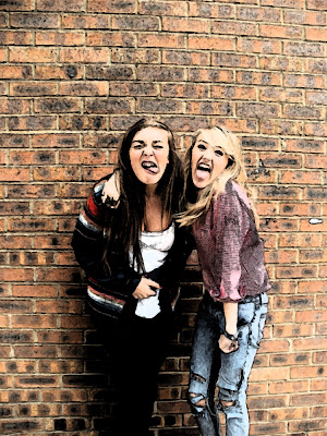
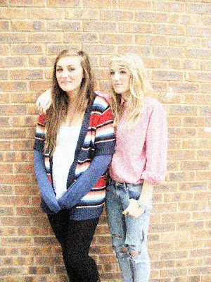
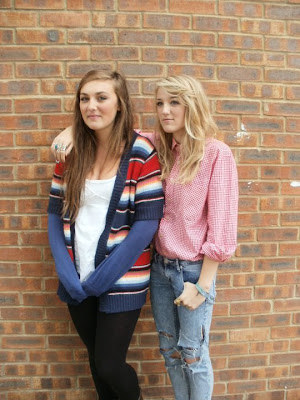
The first two are the finished photoshoped images, and the bottom two are the basic ones i took myself.
Finished Front Cover
Filling the front cover
I used an online font creator to make my Title because there was more variety and i could find something more interesting rather then the basic fonts available on photoshop. I also used Microsoft word to make some of the boxes and puffs to add to my front cover, and then saved them as images so i could paste them to the front cover.
Front Cover image preparation
This is the basic image i have taken to use for my front cover. i liked the back ground and the style of the image already so decided to not change much of that. on the other hand, the whole image looked a bit dull and lifeless, so i changed the brightness and contrast levels to make it look more fun and professional.
Tuesday, 12 October 2010
This is a picture i hve altered using Photoshop. The original image is just above, and my alterations are the above that.
For the first photoshopped image, all i did was simply increase the brightness and contrast.
For the second image up, i fiddled with the 'curves' option, where a diagonal line is displayed on a grph, and you can easily change colours and contast by distorting the line into different curves and patterns.
For the final image, i used a filter for the filter gallery. i chose the option 'artistic' then the 'coloured pencil' option th get cthe effect.
Friday, 1 October 2010
I also liked this magazine cover becuase it uses all the typical features a magazine front cover should have. it has a centra image, i main heading, a master gead and additional images on the side to interest its audience. NME is a music magazine for the younger generation, so the bright fresh coulours reflect this. Red is a common colour used throughout the colour, from the title to the lipstick on the astist on the front. The Red theme is something that is featured in most of the Nme covers, as it is the colour for the Masterhead. The yellow strip that runs through the middle also stands and highlights 'The new music magazine - NME 10 tips for 2009' which is the main point to this weeks issue.
Thursday, 30 September 2010
Interesting Magazine Covers
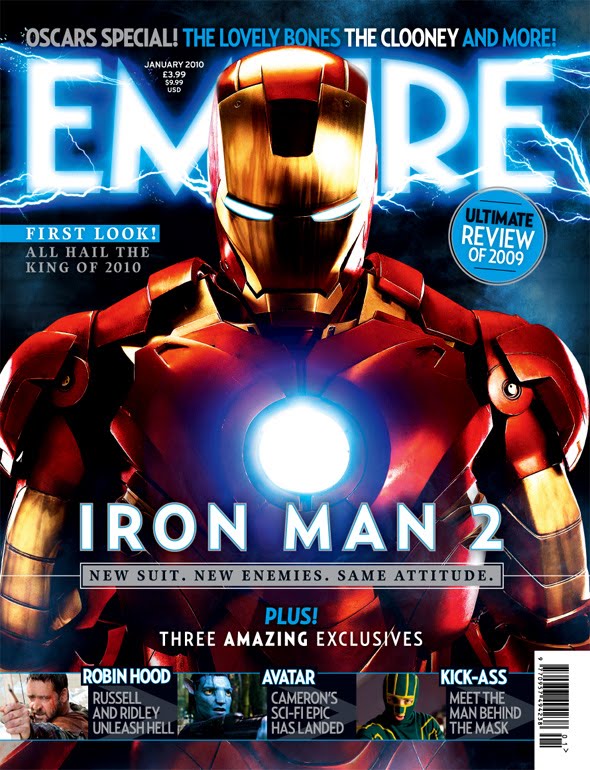
This magazine cover really stood out to me and caught my eye. the use of bright electric colours, and the metallic red and gold are impressive and also attractive. We can tell 'Empire' magazine is an established magazine by the way the central image overlaps half the title. This certain magazine cover seems to follow the theme of the film it is featuring (Iron Man 2) and we can tell this by the normal title colour which is red, is turned into an electric blue, with lightening coming out of it to fit in with Iron Man and i really like the way it is done. the whole magazine seems to almost glow. The rest of the magazine is very simple, as most on it is taken up my the image. there is a few smaller images featured at the bottom, as sort f taster to what else is inside the magazine. there is a bar code which can be found on all magazines, as well as sub headings. With the subheadings on this certain cover saying 'Iron Man 2', it almost seems like a second title, but Empire can get away with it as it is so established and popular.
Interesting Magazine Covers
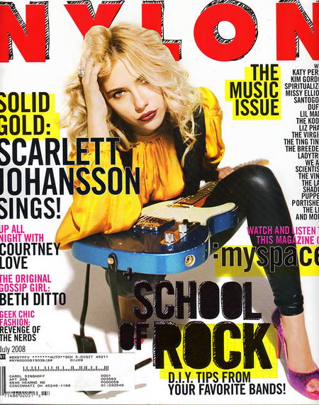
This magazine cover really stood out to me mainly because of its use of bold, primary colours. It is a cover for an American fashion magazine called 'nylon'. It inspires me for my preliminary print. i like the way the main headings on the cover are highlighted in yellow, it is almost like notes from school. I also think the way the title has a 'scratchy' scribble style makes it seem more fun and less formal, but still looks professional at the same time. The main central image is strong and empowering over the whole cover because it is strong, and the model has an alluring, no fuss look on her face; also the way she overlaps the master head shows this is an established magazine. There is quite a lot of writing, especially on the right hand side of the magazine, which fills up the page and makes it look more attractive.
Thursday, 2 September 2010
Key Media Terms
-Active consumer= a person who likes to consume the whole text, concentrates, and is dedicated to it.
- Passive consumer= Someone who vaguely consumes, more likely to let the information wash over them. They are usually less involved and aware.
- circulation= movement of material ( high circulation usually means global sales).
-Audience= the audience is a certain group of people a media text is aimed at. Their age, gender and interests all need to be considered so to insure their needs are met.
-Ideology= this is the body of ideas reflecting the social needs and aspirations of a social age group, class, or culture.
-Institution= a large organisation of similar people. a school is an institution.
-Genre= A text is classified into a genre through identification of its key elements which occur in the text. for example, different genres of film include 'comedy', 'thriller' and 'drama'.
About myself, and why i chose media
my name is abbie garland and i am a student at Chew Valley Sith form in year 12. i have chosen to study media for a few reasons. i started studying it at GCSE and really enjoyed the subject. i foud the aspects that we studied such as the popular press and film analysis interesting to write about and to discuss in class. i enjoy to watch films and read magazines in my freetime, and since learning about these materials i have started to look at them in a different, more analytical way.
I am not yet too sure what i would like to do with my future, but studying jurnalism at university has caught my eye. i have always liked english lessons and enjoy to write. i feel that media studies would really help with my understanding and knoledge of all the different aspects within jurnalism.
The aspects of 'the media' that most interest me would probably have to be the internet and film, as well as magazines. i spend alot of time on social networking sites such as facebook, like many of my peers do. I have always enjoyed watching all different types of film, things like big blockbusters, to small indie films. my preferable genre would probably have to be either comedy or thriller/mystery.
The types of magazines i read are mostly woman orientated, things such as 'Cosmopoiltan' and 'Heat Magazine' although i do sometimes read 'NME'.
I dont usually read the newspaper unless there is a featured article that takes my interest. i thing this is a bad quality in myself as newspapers keep people up to date with important things going on in our society so i would like to start ready the newspaper at least once a week.
Subscribe to:
Posts (Atom)