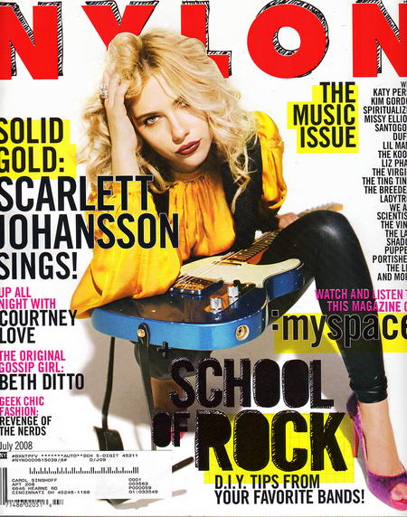
This magazine cover really stood out to me mainly because of its use of bold, primary colours. It is a cover for an American fashion magazine called 'nylon'. It inspires me for my preliminary print. i like the way the main headings on the cover are highlighted in yellow, it is almost like notes from school. I also think the way the title has a 'scratchy' scribble style makes it seem more fun and less formal, but still looks professional at the same time. The main central image is strong and empowering over the whole cover because it is strong, and the model has an alluring, no fuss look on her face; also the way she overlaps the master head shows this is an established magazine. There is quite a lot of writing, especially on the right hand side of the magazine, which fills up the page and makes it look more attractive.
No comments:
Post a Comment