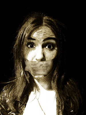

I created this effect on photo shop, turning the picture black and white, then turning up the contrast and brightness. i then adjusted the amount of yellow in the photo, to create a slight sepia tone.
i then used the 'burn' tool carefully to darken the shadows on her face. i did this on the creases on her forehead to intense her look of surprise and distress. i darkened her eye brows for more dimension and rimmed her eyes slightly to make them pop more. I also darkened her pupils, and used the 'dodge' tool to lighten the white of her eyes to increase contrast. Iused this tool to also lighten the side of her face where the light was angled to show this up more.
No comments:
Post a Comment