Tuesday, 24 April 2012
Tuesday, 20 March 2012
Monday, 5 March 2012
Friday, 2 March 2012
Ancillary task- Teaser poster photos and edits
Sticking to the conventions of any film poster, i added small print that i created myself. The image is now starting to appear more like a profession film poster.


Ancillary task- Teaser poster photos and edits
I have now down further editing to my teaser poster photo. I emulated more of the photo of the girl below by cutting out the eyes on my picture.


i have also used the 'burn' and 'dodge' tools more to create contrast and dimensions. i sued it in her hair to make it sand out more and appear less plain. i also rimmed her eyes more with the burn tool, in particular under here eyes to create the look of bags under here eyes. this, along with cutting out her pupils, makes her look less human and like a zombie, fitting in well with the genre of horror and creating a spooky, eerie vibe. The black background to the image allows the focus of the eye to be directed on the image.
Ancillary task- Teaser poster photos and edits
The photos i took, on their on, can appear quite plain. I found it difficult to use light effectively so decided to go down another route and use editing to give the photo dimension and effect. Due to the props i have used in the photo ie. the tape over her mouth, this has been enough to work with to follow up to the horror genre and sense of mystery. I already got the idea of tape over her mouth from the image inserted below. I them went on to emulate other aspects of it, such as her eyes and the colour and texture of the photo.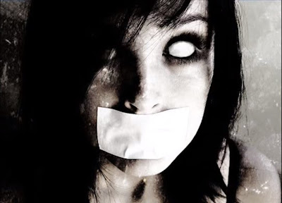
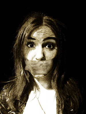
I created this effect on photo shop, turning the picture black and white, then turning up the contrast and brightness. i then adjusted the amount of yellow in the photo, to create a slight sepia tone.
i then used the 'burn' tool carefully to darken the shadows on her face. i did this on the creases on her forehead to intense her look of surprise and distress. i darkened her eye brows for more dimension and rimmed her eyes slightly to make them pop more. I also darkened her pupils, and used the 'dodge' tool to lighten the white of her eyes to increase contrast. Iused this tool to also lighten the side of her face where the light was angled to show this up more.
Thursday, 1 March 2012
Tuesday, 28 February 2012
Friday, 24 February 2012
AncillaryTask- Magazine front cover
For one of my preliminary tasks, i chose to create a magazine frot cover, featuring the film my group and I made. Aftre plenty of research into the codes and convetions of the popular movie magazine, 'Empire'.
Wednesday, 8 February 2012
After analysing other teaser posters, I have chosen to emulate a design I feel will be effective in drawing in attention, with an interesting central image. the film poster I am emulating in for 'The Eye'. I am going to take a close up photo of an eye, and then photo shop a dark and mysterious figure into the reflection.


Film teaser posters
Before creating my own teaser poster, i have research some famous and successful ones to see what conventions they follow. although similar to actual film posters, they are usually published a while before the film is released, as a way of drawing in the audience with its sense of mystery. Here are a few i found to be most effective.
I have noticed that each poster contains one stark central image to drawn in the eye, and little text. The Dark Knight poster and the Happy Potter poster both include a tag line and film title, whereas the X-men poster only includes a release date. this simplicity is effective in creating suspense and excitement towards the release date. we can tell that each of the posters belong to established films with a large fan base, due to their ambiguity, not needing to give to much away but as the same time the audience knows exactly what film is being advertised.
Another aspect that all three posters share is effective lighting. the Harry Potter and X-men poster both include well lit faces in good quality, in faded black backgrounds to draw more attention to this central image as well as further adding to the mystery. Similarly, The Dark Knight poster is dark round the edges, and the main lighting is thrown upon the central image which is effective in catching the eye.


Tuesday, 31 January 2012
Finally Filmed
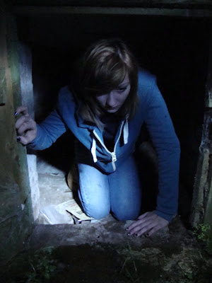
We finally got down to filming on the 25Th of January. After a lot of difficulties to do with location, we did a fair amount of changing to our original idea. Instead of basing our idea on an abandoned building and a ghost hunting team, we decided as a group to change the idea to something a little more idealistic, but still suitable to the genre of horror. Filming took place in James' house and we had one character to keep things simple and manageable. Our idea is based on a girl who is babysitting and gets terrorised in the night. We have one actress that plays the girl getting terrorised and James steps away from helping filming to play the mysterious figure doing the terrorising. All in all, i would say it was a successful evening, we got almost all filming done, as well as taking some successful shots to use as the film poster and magazine cover. Here are a few shots of the team recording.


Subscribe to:
Comments (Atom)


