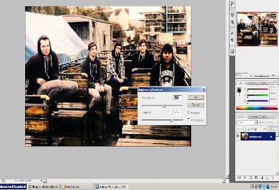


This is an example screen shot of how i tweeked the contrasts of a photo to give it more depth. i dragged the contrast up and the brightness down to create more shadow. i think it gave i more grungey look to my photo.


This is screen shot of how i changed a picture to black and white, by using the grey scale filter.
e filter.
No comments:
Post a Comment