Thursday, 21 October 2010

Finished Contents page design


I tired to stick to only a few colours just like NME did so to keep it fresh and not too in your face. i also used the same title font as i did with the front cover. Just like NME magazine, i also used a couple of images to brighten up the page.

Contents page inpiration

I looked to NME magazine for contents page inspiration. it is all very simple, sticking to about 4 colours but mostly using black writing. i like the use of images to liven up the page. i created my contents page with this one in mind.

Contents page process


Instead of using photoshop to create my contents page like i did the front cover, i used Microsoft word as i felt it would be easier to add lots of text boxes and writing with.
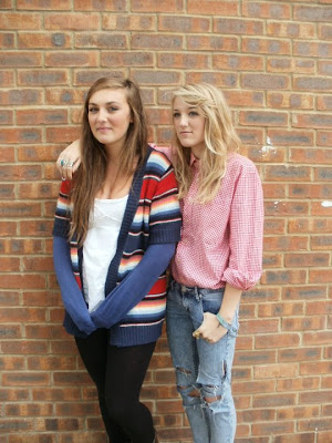
However, i photoshoped the two photos i included on the front cover to make them more interesting.
The first two are the finished photoshoped images, and the bottom two are the basic ones i took myself.

Finished Front Cover

i like my image and title font, however i think i should have used my text to fill the cover up more.

Filling the front cover


I used an online font creator to make my Title because there was more variety and i could find something more interesting rather then the basic fonts available on photoshop. I also used Microsoft word to make some of the boxes and puffs to add to my front cover, and then saved them as images so i could paste them to the front cover.

Front Cover image preparation


This is the basic image i have taken to use for my front cover. i liked the back ground and the style of the image already so decided to not change much of that. on the other hand, the whole image looked a bit dull and lifeless, so i changed the brightness and contrast levels to make it look more fun and professional.

Tuesday, 12 October 2010


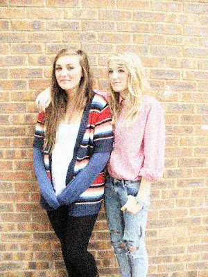
This is a picture i hve altered using Photoshop. The original image is just above, and my alterations are the above that.
For the first photoshopped image, all i did was simply increase the brightness and contrast.
For the second image up, i fiddled with the 'curves' option, where a diagonal line is displayed on a grph, and you can easily change colours and contast by distorting the line into different curves and patterns.
For the final image, i used a filter for the filter gallery. i chose the option 'artistic' then the 'coloured pencil' option th get cthe effect.


This is a flatplan i have created for my preliminary magazine. i have based it on the layout of Q magazine becuase i found Q Magazine's layout not too fussy, but also incuded all the main features of a typical magazine front cover.

Friday, 1 October 2010


I also liked this magazine cover becuase it uses all the typical features a magazine front cover should have. it has a centra image, i main heading, a master gead and additional images on the side to interest its audience. NME is a music magazine for the younger generation, so the bright fresh coulours reflect this. Red is a common colour used throughout the colour, from the title to the lipstick on the astist on the front. The Red theme is something that is featured in most of the Nme covers, as it is the colour for the Masterhead. The yellow strip that runs through the middle also stands and highlights 'The new music magazine - NME 10 tips for 2009' which is the main point to this weeks issue.