Thursday, 28 April 2011
Thursday, 7 April 2011


Friday, 1 April 2011


i have now added for structure to this page. text boxes and headings show where i will place information, and clean lines give these boxes more definition.

I have now added my text into the featured box. i used bold red lettering for the main subheadings, and a description in smaller lettering to add more information. i have also added extra features such as '80 Friendly Fires' to fill up some space and added an image for the 'ALT review'.
Contents page development
 This is the basic design for my contents page. The layout is based largely on one from Q magazine.i have added in the vital features first, such as the title, my magazine title, the date and the main focus, being the photo. i will be sticking to a colour scheme and black, white, and a nit of red. these colours or typical of the print industry because they are bold and alter your attention.
Thursday, 10 March 2011
Final front cover design
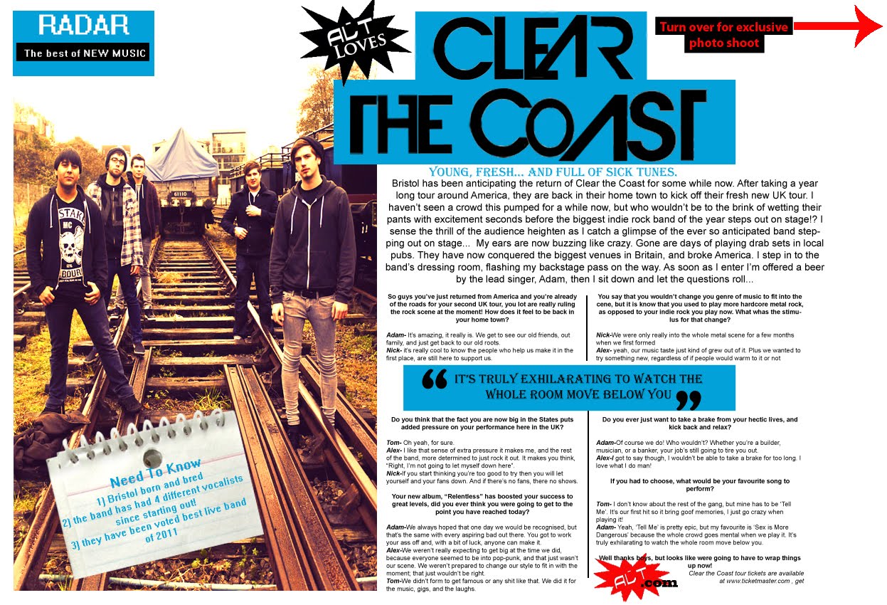
 This is my complete front cover design. i based certain aspects of the layout on Q magazine, as well as the colour scheme. i decided to keep the colour scheme very simple, using mostly white with certain areas being red to give it a bit more colour. these colours are also typical of music magazines such as Q and NME and tabloid newspapers, mostly because they are eye catching. i like the page flip i have added in the top left hand corner, its just something a little extra that gives the whole cover a more professional feel. i can afford to not crowd the page with text and extra images because the angle of the people allow a lot of page to already be filled, so makes it seem busy even with lots of subtitles and boxes.
Process of front cover

Almost finished. i have added a tag line under the title as this is a common feature for magazines. i have also put in the price, issue number, date, and a bar code, as well as adding an extra subtitle to fill in the blank spaces.

Now the cover looks more developed. i added extra text such as other bands included in the magazine, and some extra information in the exclusive article on 'Clear the Coast'.

This is what i started with. it took me a while to find the perfect font for the title because i wanted something that would fit the genre of the magazine but i think this one fits in well. at the moment things are very basic and the cover looks more like a poster then a front page.
Subscribe to:
Posts (Atom)